Natural Skincare Packaging Design
NEEDS
Ruth came to me wanting to make a small adjustment to her logo, update the packaging on her line of palm-oil-free lip balms, and create a stamp for her new palm-free soaps. Ruth wanted them to be super fun, bright, and earthy. With her choice of colors, I knew we would be a perfect match!
SOLUTION
After speaking with Ruth to get a feel for her personality and reviewing her completed Pinterest homework I began the design process.
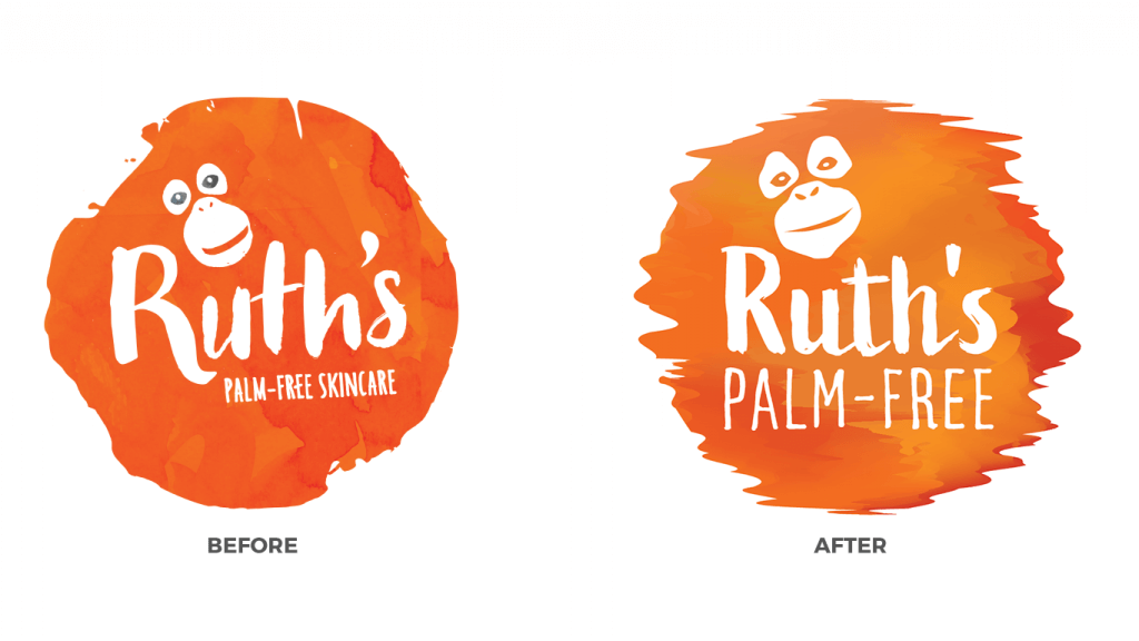
As I went to remove "skincare" from her original logo I realized that it wasn't a vector file, meaning that I couldn't easily alter her logo. After some back and forth with her original designer we discovered that there wasn't an original vector file. And even worse, part of the logo was similar to many other logos featuring the face of an orangutan!
We decided that it would be best to completely overhaul the logo with a new design. This way she could avoid any sort of legal issues in the future and could be comfortable knowing that her logo is 100% original.
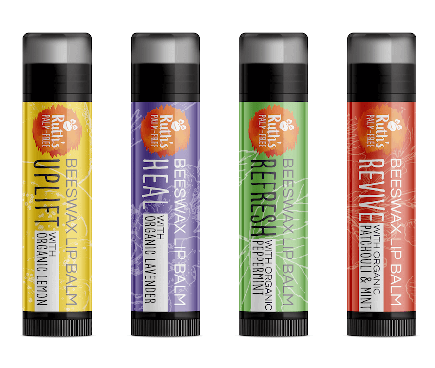
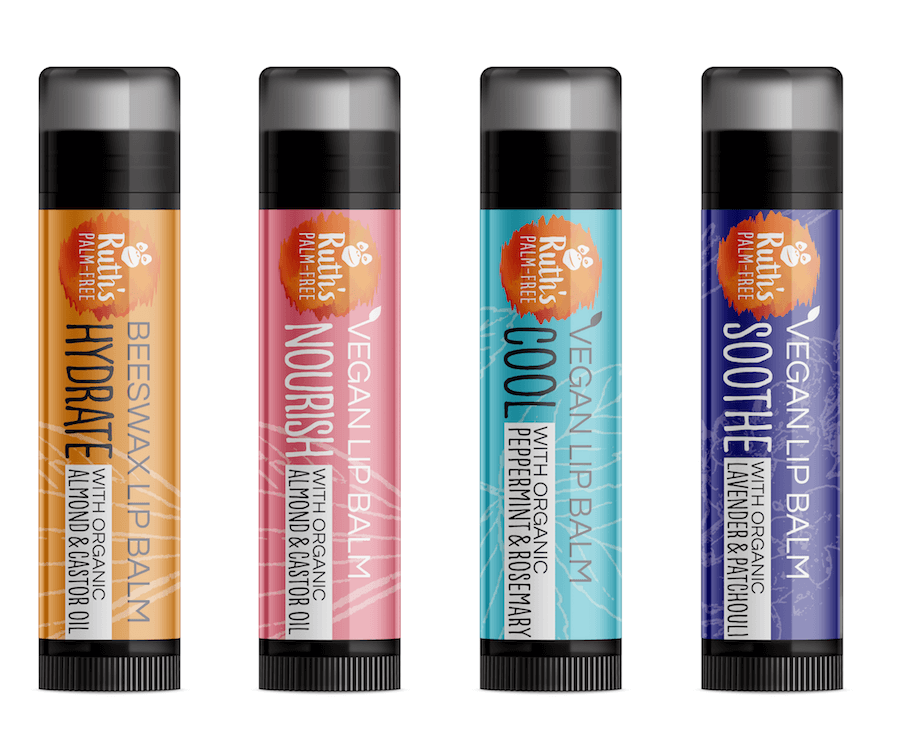
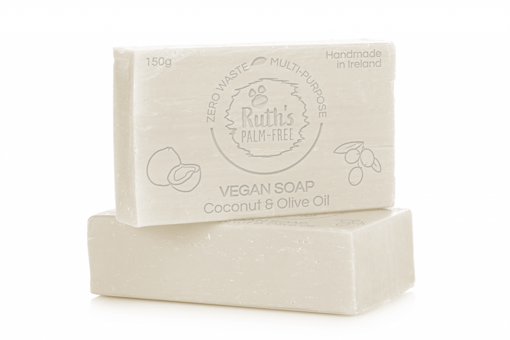
We decided to go away from the palm leaves of her previous packaging and feature the natural and organic ingredients that she includes in each of her lip balms with bright vibrant colors. For the soap stamp, I went with a simple design that also featured the natural ingredients of the product.
In the end, Ruth and I were very happy with how they came out! If you are ever in Ireland look out for her lip balms wherever environmentally conscious skincare is sold!
PROJECT SCOPE
- Refreshed Logo
- Analysis of lip balm and skincare market
- 8 Lip balm labels
- 1 Soap stamp
-
Date
May 15, 2019
-
Client
Ruth, Ruth's Palm Free